
Sliders
Sliders let the player choose a value on an item: a variation, a color, a position... They are defined in the sliders list of an item, and several sliders can be used on the same item.
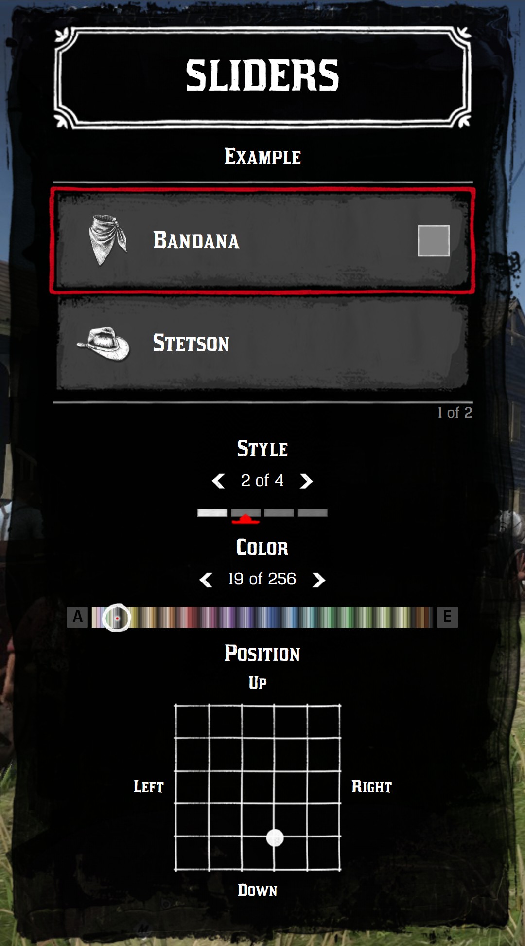
| Type | Usage |
|---|---|
| Default | Choose between a list of values, like the variations of a cloth |
| Switch | Choose between a list of labels, displayed on the right of the item |
| Grid | Choose one or two numbers between a min and a max, like a position |
| Palette | Choose a color in a palette of the game |
| Sprite | Choose between a list of images |
| Color | Choose between a list of colors |
Read the values
When a slider changes, the onChange callback of the item is fired. The sliders are available in currentData.item.sliders, in the same order as you defined them.
menu:addItem({
  title = "Bandana",
  sliders = {
    { title = "Style", values = { "Classic", "Rolled", "Open" } },
    { type = "palette", title = "Color", tint = "tint_generic_clean" },
  },
  onChange = function(currentData)
    local style = currentData.item.sliders[1]
    local color = currentData.item.sliders[2]
    if style.changed then
      print("New style:", style.value) -- "Rolled"
    end
    if color.changed then
      print("New tint:", color.value) -- 12
    end
  end,
})
Each slider has:
current: the position of the slider.value: the value of the slider, computed fromcurrent:
| Type | value |
|---|---|
| Default, switch, sprite, color | The selected entry of values: values[current] |
| Palette | The tint index: current |
| Grid | {x, y}: values[1].current and values[2].current |
changed:trueif this slider changed during the lastonChange. Use it to know which slider moved, when an item has several sliders.
TIP
jo.menu.doesActiveButtonChange() tells if the event comes from a slider move or from a change of the active item.
Common keys
| Key | Type | Description |
|---|---|---|
type | string | The type of slider. Without type, the slider is a default slider |
title | string | The title above the slider Optional |
description | string | A text under the slider. HTML is allowed Optional |
current | integer | The position of the slider, from 1 Optional default: 1 |
values | table | The list of values |
looped | boolean | Go back to the first value after the last one Optional default: true |
forceDisplay | boolean | Display the slider even with only one value Optional default: false |
translate | boolean | Use title (and the labels) as a key of the translations Optional default: false |
Default
The default slider of the game: a counter and a box per value. values can contain anything: strings, numbers or tables with your own data.
menu:addItem({
  title = "Stetson",
  icon = "hats",
  sliders = {
    {
      title = "Variation",
      current = 3,
      values = {
        { label = "Brown", hash = `HAT_STETSON_BROWN` },
        { label = "Black", hash = `HAT_STETSON_BLACK` },
        { label = "Grey", hash = `HAT_STETSON_GREY` },
        { label = "White", hash = `HAT_STETSON_WHITE` },
        { label = "Red", hash = `HAT_STETSON_RED` },
      },
    },
  },
})
A slider with only one value is hidden, unless forceDisplay = true.
Description
{ title = "Variation", current = 2, values = { "Brown", "Black", "Grey" }, description = "Hold <b>Shift</b> to rotate the hat" }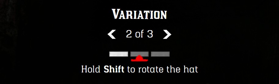
Price of a value
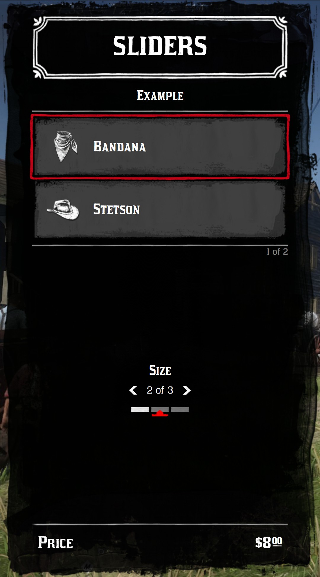
A value with a price key replaces the price of the item while it's selected. It works with the default, switch, sprite and color sliders. The price format is described in Prices.
menu:addItem({
  title = "Bandana",
  price = { money = 5 },
  sliders = {
    {
      title = "Size",
      current = 2,
      values = {
        { label = "Small", price = { money = 5 } },
        { label = "Medium", price = { money = 8 } },
        { label = "Large", price = { money = 12, gold = 1 } },
      },
    },
  },
})
Switch
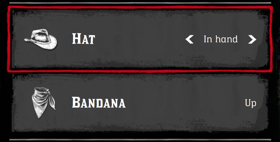
The switch is displayed on the right of the item, in a list menu. Its arrows are displayed on the active item only. The label of each value is displayed.
menu:addItem({
  title = "Hat",
  icon = "hats",
  sliders = {
    {
      type = "switch",
      current = 2,
      values = {
        { label = "On head" },
        { label = "In hand" },
        { label = "Hidden" },
      },
    },
  },
})
TIP
The left and right arrows of the keyboard change the first switch of the item, or its first slider if it has no switch.
Grid
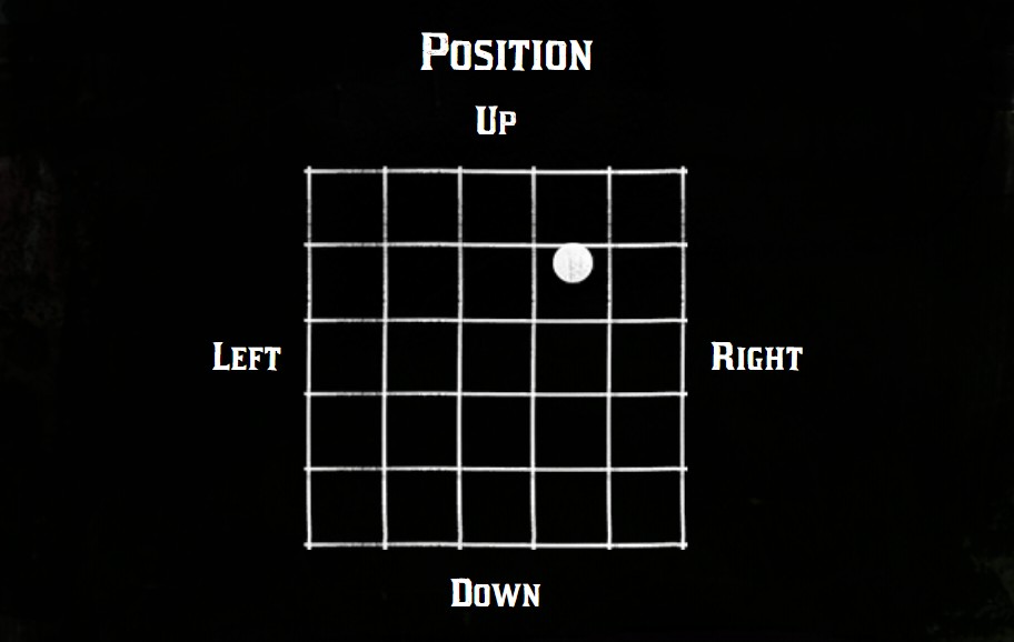
The grid slider chooses a number between a min and a max, with the mouse or the keyboard (W A S D). With one entry in values, it's horizontal. With two entries, it's a 2D grid.
| Key | Type | Description |
|---|---|---|
labels | table | The labels around the grid: {left, right, top, bottom} Optional |
values[n].current | number | The current value |
values[n].min | number | The value on the left (or on the top) |
values[n].max | number | The value on the right (or on the bottom) |
values[n].gap | number | The step between two values Optional default: 1 |
Set the gap
The default gap is 1: with min = -1 and max = 1, only -1, 0 and 1 can be selected. Set a smaller gap, like 0.01, for a smooth slider.
One dimension
menu:addItem({
  title = "Hat",
  sliders = {
    {
      type = "grid",
      title = "Width",
      labels = { "Thin", "Wide" },
      values = {
        { current = 0.3, min = 0.0, max = 1.0, gap = 0.01 },
      },
    },
  },
})
Two dimensions
menu:addItem({
  title = "Hat",
  sliders = {
    {
      type = "grid",
      title = "Position",
      labels = { "Left", "Right", "Up", "Down" },
      values = {
        { current = 0.4, min = -1.0, max = 1.0, gap = 0.05 }, -- horizontal
        { current = -0.5, min = -1.0, max = 1.0, gap = 0.05 }, -- vertical
      },
    },
  },
  onChange = function(currentData)
    local x, y = table.unpack(currentData.item.sliders[1].value)
  end,
})
Palette
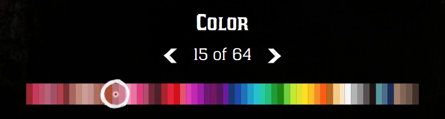
The palette slider chooses a color in a palette of the game, like the tints of the clothes.
| Key | Type | Description |
|---|---|---|
tint | string | The name of the palette. See Available palettes. palette works too |
current | integer | The index of the selected color, from 0 Optional default: min |
min | integer | The first color available Optional default: 0 |
max | integer | The last color available Optional default: the last color of the palette |
disabledTints | table | The list of the color indexes to hide Optional |
The value of a palette slider is the index of the selected color, ready to use with the natives of the game.
menu:addItem({
  title = "Lipstick",
  sliders = {
    { type = "palette", title = "Color", tint = "tint_makeup", current = 14 },
  },
})
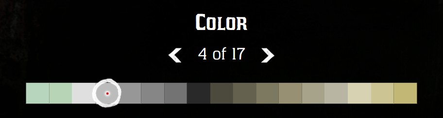
Limit the colors
{
  type = "palette",
  title = "Color",
  tint = "tint_generic_clean",
  min = 10,
  max = 30,
  disabledTints = { 12, 13, 14, 20 },
  current = 16,
}
Several palettes
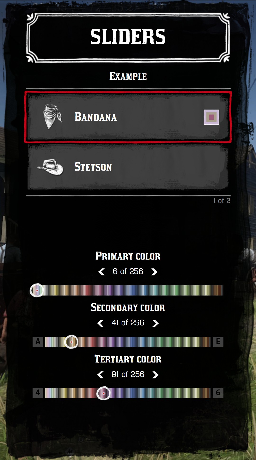
Clothes of the game have up to 3 tints. Use one palette slider per tint, and previewPalette = true on the item to display the combination on the right of the item. The second and third palettes display their keyboard shortcuts (Q E and 4 6).
menu:addItem({
  title = "Bandana",
  icon = "neckerchiefs",
  previewPalette = true,
  sliders = {
    { type = "palette", title = "Primary color", tint = "tint_generic_clean", current = 5 },
    { type = "palette", title = "Secondary color", tint = "tint_generic_clean", current = 40 },
    { type = "palette", title = "Tertiary color", tint = "tint_generic_clean", current = 90 },
  },
})
Available palettes
The palette names of the game (like metaped_tint_generic_weathered or metaped_tint_hat_clean) are also accepted: they use the closest palette below.
| Name | Colors |
|---|---|
tint_generic_clean |  |
tint_hair |  |
tint_horse |  |
tint_horse_leather |  |
tint_leather |  |
tint_makeup |  |
tint_eye |  |
metaped_tint_generic_clean |  |
metaped_tint_hair |  |
metaped_tint_horse |  |
metaped_tint_horse_leather |  |
metaped_tint_leather |  |
metaped_tint_makeup |  |
metaped_tint_eye |  |
metaped_tint_animal |  |
metaped_tint_combined |  |
metaped_tint_combined_leather |  |
metaped_tint_hat |  |
metaped_tint_mpadv |  |
generic_wagon_palette |  |
Sprite
The sprite slider displays a list of images. type = "sprite" and type = "color" are the same slider: each value can be an image or a color.
| Key of a value | Type | Description |
|---|---|---|
sprite | string | An image of jo_libs/nui/menu/assets/images without .png, like tints/metal_swatch_gold, or a full URL |
icon | string | A small icon displayed on the image Optional |
iconClass | string | CSS classes of the icon Optional |
tagColor | string | The CSS color of a tag in the corner Optional |
tagText | string | A text in the tag Optional |
tagTextColor | string | The CSS color of the text of the tag Optional default: black |
price | number|table | See Price of a value Optional |
menu:addItem({
  title = "Revolver",
  sliders = {
    {
      type = "sprite",
      title = "Metal",
      current = 2,
      values = {
        { sprite = "tints/metal_swatch_gold" },
        { sprite = "tints/metal_swatch_silver" },
        { sprite = "tints/metal_swatch_copper" },
        { sprite = "tints/metal_swatch_brass" },
        { sprite = "nui://my_resource/images/my_metal.png" },
      },
    },
  },
})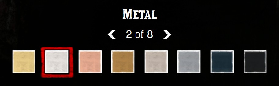
The tints folder contains the swatches of the game: hair colors, eye colors, skin tones, metals, woods, leathers, engravings...
Tags and icons
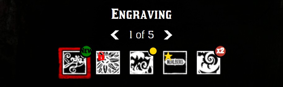
values = {
  { sprite = "tints/gunsmith_engraving_1", tagColor = "green", tagText = "New" },
  { sprite = "tints/gunsmith_engraving_2", icon = "lock", iconClass = "fred" },
  { sprite = "tints/gunsmith_engraving_3", tagColor = "gold" },
  { sprite = "tints/gunsmith_engraving_4", icon = "star", iconClass = "fgold" },
  { sprite = "tints/gunsmith_engraving_5", tagText = "x2", tagColor = "#c0392b", tagTextColor = "white" },
}
Tick
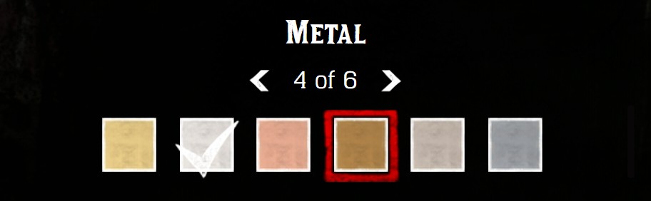
displayTick = true displays a tick on a value, like the equipped one. tickIndex is the index of this value, from 0.
{
  type = "sprite",
  title = "Metal",
  current = 4,
  displayTick = true,
  tickIndex = 1, -- the 2nd value
  values = { ... },
}
Color
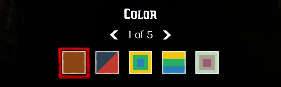
A value without sprite is displayed as a color:
| Key of a value | Type | Description |
|---|---|---|
rgb | string|table | A CSS color, or a list of up to 3 CSS colors |
palette | table | The colors of a palette: {palette = name, tint0 = index, tint1 = index, tint2 = index} |
style | string | "vertical-lines" to display several colors as vertical lines Optional |
The other keys of a sprite value (icon, tagColor, price...) work too.
menu:addItem({
  title = "Bandana",
  sliders = {
    {
      type = "color",
      title = "Color",
      values = {
        { rgb = "#8B4513" },
        { rgb = { "#2c3e50", "#c0392b" } },
        { rgb = { "#f1c40f", "#27ae60", "#2980b9" } },
        { rgb = { "#f1c40f", "#27ae60", "#2980b9" }, style = "vertical-lines" },
        { palette = { palette = "tint_generic_clean", tint0 = 10, tint1 = 40, tint2 = 90 } },
      },
    },
  },
})
Keyboard
| Slider | list menu | tile menu |
|---|---|---|
| 1st slider (or 1st switch) | ← → | Q / A E |
| 2nd slider | Q / A E | 4 6 |
| 3rd slider | 4 6 | - |
| Grid | W A S D | W A S D |
The mouse wheel changes the slider under the cursor, and a click on a box selects its value.