Items
Items are added to a menu with MenuClass:addItem(). This page shows every option of an item. The full list of keys is in the reference.
Add an item
local menu = jo.menu.create("tailor", { title = "Tailor", subtitle = "Hats" })

-- Add at the end
local item = menu:addItem({
  title = "Stetson",
  icon = "hats",
  data = { hash = `HAT_STETSON`, price = 12.5 }, -- your own data
  onClick = function(currentData)
    print("Selected hat:", currentData.item.data.hash)
  end,
})

-- Add at the first position
menu:addItem(1, { title = "Remove the hat" })

menu:send()addItem()returns the item. Keep it to update it later.datastores your own values. They are available in the callbacks withcurrentData.item.data.- The callbacks of the items (
onActive,onClick,onChange,onExit,onTick) are detailed in Events.
Title and subtitle
title is the label of the item, subtitle a second line under it. Both accept HTML.
menu:addItem({ title = "Stetson", subtitle = "Brown felt", icon = "hats" })
menu:addItem({ title = "Bowler <span style='color:#d4af37'>★</span>", icon = "hats" })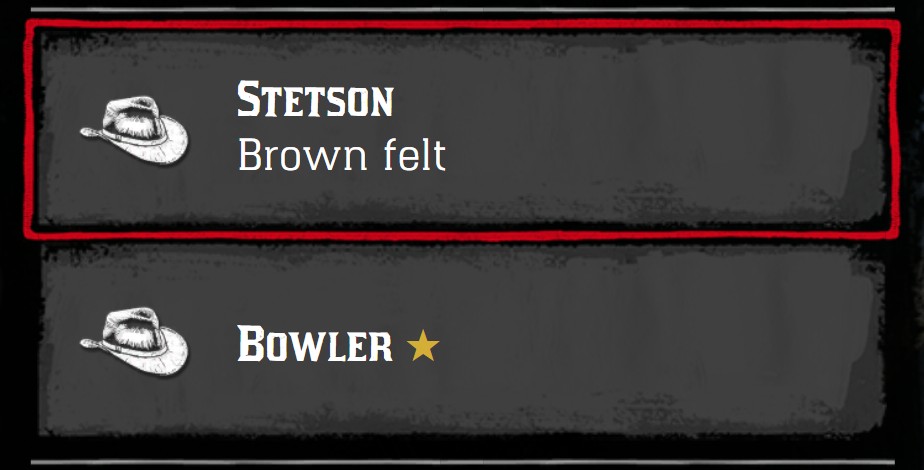
Icon
icon displays an icon on the left of the item. It's the filename of an icon of the menu (without .png), or a full URL.
- An item with an icon is twice as high as an item without icon.
iconSize = "small"displays a small icon, and keeps the height of an item without icon.iconClassapplies CSS classes to the icon, likefgoldorbw.
menu:addItem({ title = "Icon of the menu", icon = "horse_saddles" })
menu:addItem({ title = "Image URL", icon = "nui://my_resource/images/gold.png" })
menu:addItem({ title = "Small icon", icon = "horse_saddles", iconSize = "small" })
menu:addItem({ title = "Without icon" })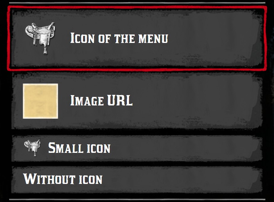
Prefix
prefix displays a small icon before the title. The star icon is displayed in gold.
menu:addItem({ title = "Legendary saddle", prefix = "star", icon = "horse_saddles" })
menu:addItem({ title = "Locked saddle", prefix = "lock", icon = "horse_saddles" })
menu:addItem({ title = "Damaged saddle", prefix = "warning", icon = "horse_saddles" })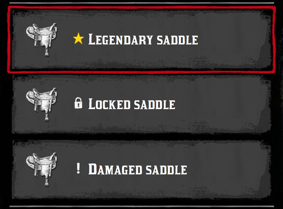
Right side
Icon on the right
iconRight displays an icon on the right of the item, like a tick for the equipped item.
menu:addItem({ title = "Equipped", icon = "horse_saddles", iconRight = "tick" })
menu:addItem({ title = "Locked", icon = "horse_saddles", iconRight = "lock" })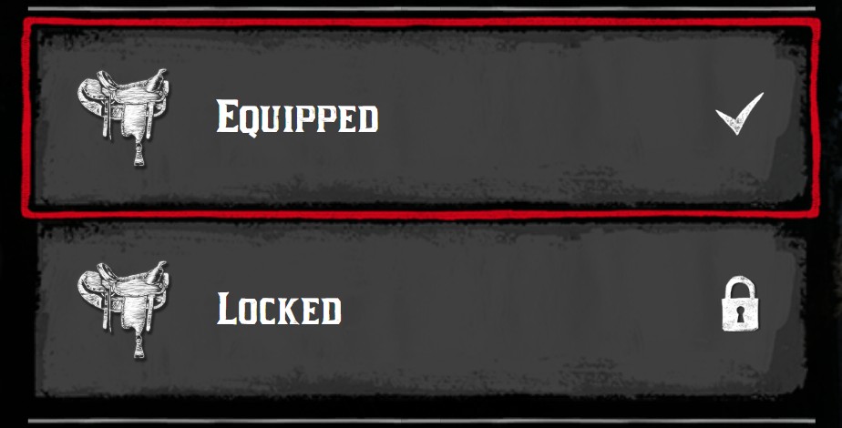
Text on the right
textRight displays a text on the right of the item. textRightClass = "tiny" makes it smaller.
menu:addItem({ title = "Saddles", icon = "horse_saddles", textRight = "12" })
menu:addItem({ title = "Horse", icon = "toast_horse_bond", textRight = "Level 4", textRightClass = "tiny" })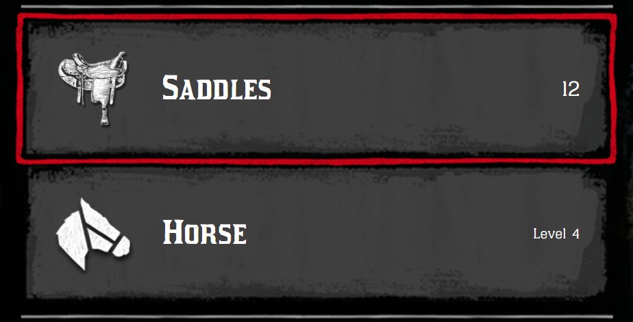
To display a price on the right, see priceRight.
Description, footer and image
The description area under the list displays the image, the description and the statistics of the active item.
Description
description accepts HTML.
menu:addItem({
  title = "Stetson",
  icon = "hats",
  description = "A wide brim hat made of felt.<br><b>Protects you from the sun.</b>",
})
Footer
footer is displayed at the very bottom of the menu, under the price. It accepts HTML.
menu:addItem({ title = "Stetson", icon = "hats", footer = "Press <b>Enter</b> to buy this hat" })
Image
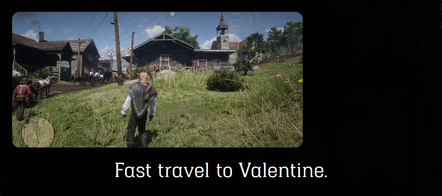
image displays an image above the description. It's a URL, or a table {url, width, height, radius, style}, like the image of a menu.
menu:addItem({
  title = "Valentine",
  icon = "toast_horse_bond",
  description = "Fast travel to Valentine.",
  image = {
    url = "nui://my_resource/images/valentine.jpg",
    width = 300,
    height = 140,
    radius = 8,
    style = "object-fit: cover",
  },
})
Colors
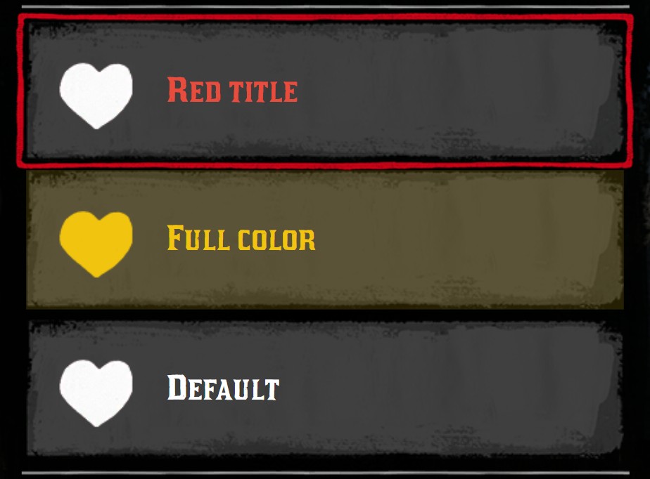
color changes the color of the item:
- a string: the CSS color of the title,
- a table, to color each part of the item:
| Key | Description |
|---|---|
title | Color of the title |
background | Color of the background of the item. Use a transparent color, like rgba(241, 196, 15, 0.15) |
accent | Color of the border of the active item |
icon | Color of the icon |
menu:addItem({ title = "Red title", icon = "player_health", color = "#e74c3c" })
menu:addItem({
  title = "Full color",
  icon = "player_health",
  color = {
    title = "#f1c40f",
    background = "rgba(241, 196, 15, 0.15)",
    accent = "#f1c40f",
    icon = "#f1c40f",
  },
})
Disabled and hidden items
disabled = truegreys out the item: it can't be clicked, its sliders are hidden and its icon is displayed in black and white.visible = falsehides the item.
menu:addItem({ title = "Available", icon = "horse_saddles" })
menu:addItem({ title = "Disabled", icon = "horse_saddles", disabled = true, prefix = "lock" })
menu:addItem({ title = "Hidden", visible = false })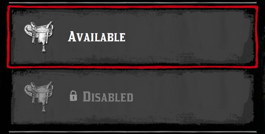
Prices
price displays the price of the active item at the bottom of the menu. A price can be:
| Format | Example | Displayed |
|---|---|---|
| A number | price = 4.25 | $4.25 |
| Money | price = { money = 4.25 } | $4.25 |
| Gold | price = { gold = 3 } | 3 gold |
| Money and gold | price = { money = 25, gold = 2 } | 2 gold and $25 |
| A list of costs | price = { { money = 5 }, { item = "wheel", quantity = 1 } } | Each cost, separated by + |
| Free | price = 0 | Free |

price = 4.25
price = { gold = 3 }
price = { money = 25, gold = 2 }
price = 0Items as a price
In a list of costs, an inventory item is a table with the keys:
| Key | Type | Description |
|---|---|---|
item | string | The name of the item in your inventory |
quantity | integer | The quantity Optional default: 1 |
label | string | The label displayed under the image Optional |
image | string | An icon of the menu or an image URL Optional |
tooltip | boolean | Display the label in a tooltip instead of under the image Optional |
quantityStyle | string | "circle" to display the quantity in a circle on the image Optional |
menu:addItem({
  title = "Wagon repair",
  icon = "wagon",
  price = {
    { money = 5 },
    { item = "horseshoe", quantity = 3, label = "Horseshoe", image = "horseshoes" },
    { item = "wheel", quantity = 1, label = "Wheel", image = "wheel", quantityStyle = "circle" },
  },
})
TIP
The prices use the format of the Pricing module. To compute the price of an action, like a tax or the sum of several prices, use the functions of this module.
Price title
priceTitle replaces the "Price" label. To translate it for all the menus, use the price key of jo.menu.updateLang().
menu:addItem({ title = "Stable slot", icon = "toast_horse_bond", price = { money = 10 }, priceTitle = "Rent per day" })
Price on the right
priceRight displays a price on the right of the item: true displays the price of the item, any other value is displayed as a price.
menu:addItem({ title = "Flannel shirt", icon = "shirts_full", price = 4.25, priceRight = true })
menu:addItem({ title = "Saddle", icon = "horse_saddles", priceRight = { gold = 2 } })
menu:addItem({ title = "Old hat", icon = "hats", price = 0, priceRight = true })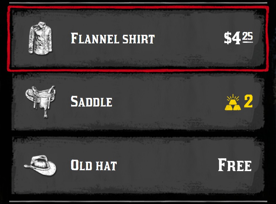
Other prices
- The menu can display a price for all the items without price: see Price of the menu.
- Each value of a default slider can have its own price: see Price of a value.
Tile items
In a tile menu, items have some additional options.
Quantity, quality and stars
| Key | Type | Description |
|---|---|---|
quantity | number | A number in a circle, in the bottom right corner |
quantityCircleClass | string | CSS classes of the circle, like fgold |
quality | integer | A quality from 1 to 3, displayed with stars in the top left corner |
qualityClass | string | CSS classes of the quality stars |
stars | table | A row of stars: {current, total} |
starsClass | string | CSS classes of the row of stars |
local menu = jo.menu.create("satchel", { title = "Satchel", type = "tile" })
menu:addItem({ title = "Quantity", icon = "satchels", quantity = 12 })
menu:addItem({ title = "Gold quantity", icon = "satchels", quantity = 3, quantityCircleClass = "fgold" })
menu:addItem({ title = "Quality", icon = "horse_saddles", quality = 2 })
menu:addItem({ title = "Stars", icon = "horse_saddles", stars = { 3, 5 } })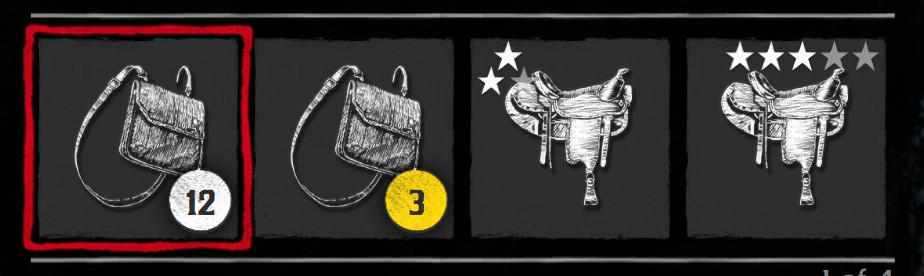
Icon on the right
In a tile, iconRight is displayed in the bottom right corner.
menu:addItem({ title = "Equipped", icon = "horse_saddles", iconRight = "tick" })
menu:addItem({ title = "Locked", icon = "horse_saddles", iconRight = "lock", iconClass = "bw" })
menu:addItem({ title = "New", icon = "horse_saddles", iconRight = "star" })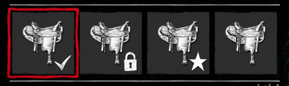
Image padding
tilePadding sets the space between the image and the edge of the tile: a number in vh, or a CSS length. 0 brings the image to the edge, useful for pictures or color swatches.
menu:addItem({ title = "Default padding", icon = "nui://my_resource/images/copper.png" })
menu:addItem({ title = "tilePadding = 0.5", icon = "nui://my_resource/images/copper.png", tilePadding = 0.5 })
menu:addItem({ title = "tilePadding = 0", icon = "nui://my_resource/images/copper.png", tilePadding = 0 })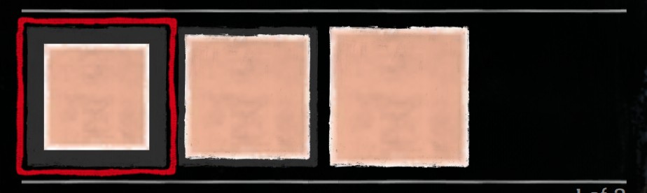
Color preview
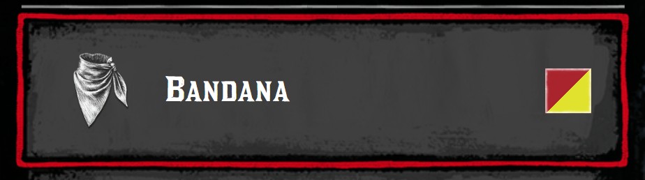
previewPalette = true displays a square with the current color of the item, on the right of the item. It shows the palette sliders of the item (up to 3 colors), or the current value of a sprite or color slider. See Sliders.
menu:addItem({
  title = "Bandana",
  icon = "neckerchiefs",
  previewPalette = true,
  sliders = {
    { type = "palette", title = "Main color", tint = "tint_makeup", current = 22 },
    { type = "palette", title = "Second color", tint = "tint_makeup", current = 44 },
  },
})