
Input Client
A library to display native and NUI input panels.
jo.input.loadNUI()
Loads the Input NUI.
Syntax
jo.input.loadNUI()jo.input.native()
Opens the native game input.
Syntax
jo.input.native(label, placeholder, maxStringLength)Parameters
label : string
Text displayed above the native input.
placeholder : string
Placeholder displayed in the native input.
maxStringLength : integer Optional
Maximum number of characters. Defaults to
60.
Return Value
Type : string
The entered text, or an empty string when the input is cancelled.
jo.input.nui()
Opens a NUI input panel containing one or more rows of entries.
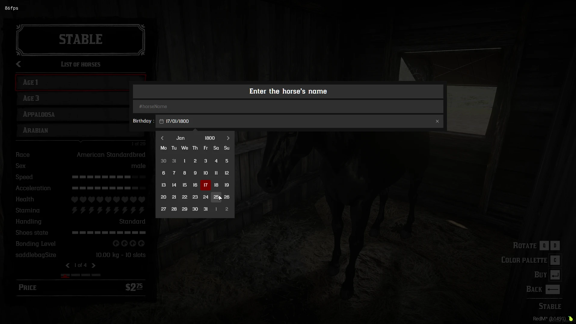
Syntax
jo.input.nui(options, cb)Parameters
options : table
{
  rows = { -- list of row objects
    {
      position = "content", -- "header", "content" or "footer"
      columns = {             -- entries rendered in this row
        { type = "title", value = "Enter the horse's price" },
      },
    },
  },
  lang = Lang, -- optional translations
}
Each row is an object with a columns array. position is optional and defaults to "content":
"header": fixed content above the scrollable area;"content": main scrollable area;"footer": fixed content below the scrollable area.
When lang is provided, only string keys prefixed with inputNui are sent to the NUI for translation.
cb : function Optional
Callback receiving the result. When omitted,
jo.input.nuiwaits synchronously and returns the result.
Common entry properties
Entries can use the following shared properties:
{
  id = "entry_id",       -- identifier used by labels and in the result
  class = "custom-class", -- CSS class or built-in class
  style = {               -- inline CSS properties
    color = "#f0c674",
  },
  width = 50,              -- number = percentage, string = CSS width
}
id must be unique when it is used as a label target or when the value is read from the result. style is a Lua table of CSS properties, not a CSS string.
Example
local Lang = {
  inputNuiPaymentOptions = "Payment options",
  inputNuiOrExplanation = "Set how the price can be paid",
}

local options = {
  lang = Lang,
  rows = {
    {
      position = "header",
      columns = {
        { type = "title", value = "Enter the horse's price" },
        { type = "description", value = "Complete the form below" },
      },
    },
    {
      columns = {
        { type = "label", value = "Name:", target = "name", width = 10 },
        {
          type = "text",
          id = "name",
          placeholder = "A horse name",
          required = true,
        },
      },
    },
    {
      columns = {
        { type = "label", value = "Birthday:", target = "birthday", width = 10 },
        {
          type = "date",
          id = "birthday",
          placeholder = "Select a date",
          yearRange = { 1800, 1900 },
          format = "dd/MM/yyyy",
          required = true,
        },
      },
    },
    {
      columns = {
        { type = "label", value = "Choice:", target = "choice", width = 10 },
        {
          type = "select",
          id = "choice",
          placeholder = "Choose an option",
          options = {
            { value = 1, label = "Option 1" },
            { value = 2, label = "Option 2" },
          },
          required = true,
        },
      },
    },
    {
      position = "footer",
      columns = {
        {
          type = "button",
          id = "confirm",
          value = "Confirm",
          icon = "nui://jo_libs/nui/input/assets/ui/tick.png",
          class = "success",
        },
        {
          type = "button",
          id = "close",
          value = "Close",
          class = "flat",
          ignoreRequired = true,
        },
      },
    },
  },
}

-- Synchronous
local input = jo.input.nui(options)
if input then
  log("Button pressed:", input.action)
  log(input.result)
end

-- Asynchronous
jo.input.nui(options, function(input)
  if input then
    log(input.action, input.result)
  end
end)
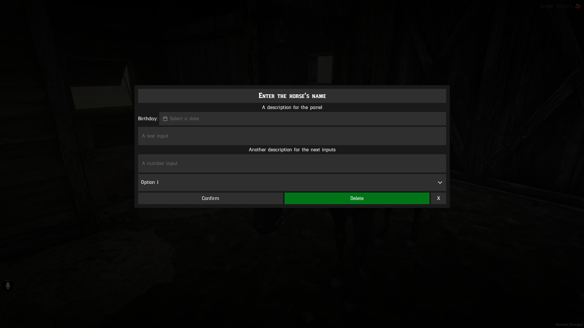
Preview:
Entry types
Title
{
  type = "title",
  value = "Enter the horse's price",
  class = "custom-class", -- optional
  style = {},              -- optional CSS properties
}
Description
{
  type = "description",
  value = "Complete the form below",
  class = "custom-class", -- optional
  style = {},              -- optional CSS properties
}
Label
Use target to associate a label with the id of an input, select, or date entry.
{
  type = "label",
  value = "Birthday:",
  target = "birthday",
  class = "custom-class", -- optional
  style = {},              -- optional CSS properties
}
Text
{
  type = "text",
  id = "name",
  value = "",              -- optional initial value
  placeholder = "A name",  -- optional
  required = true,          -- optional
  class = "custom-class",  -- optional
  style = {},               -- optional CSS properties
}
Number
{
  type = "number",
  id = "amount",
  value = 0,                 -- optional initial value
  min = 0,                   -- optional
  max = 10,                  -- optional
  step = 0.01,               -- optional
  placeholder = "An amount", -- optional
  required = true,           -- optional
  class = "custom-class",   -- optional
  style = {},                -- optional CSS properties
}
Date
{
  type = "date",
  id = "birthday",
  value = "",                 -- optional initial value
  yearRange = { 1800, 1900 },  -- optional
  format = "dd/MM/yyyy",      -- optional display and model format
  placeholder = "Select a date", -- optional
  required = true,             -- optional
  class = "custom-class",     -- optional
  style = {},                  -- optional CSS properties
}
Select
{
  type = "select",
  id = "choice",
  value = { value = 1, label = "Option 1" }, -- optional initial value
  options = {
    { value = 1, label = "Option 1" },
    { value = 2, label = "Option 2" },
  },
  placeholder = "Choose an option", -- optional
  required = true,                   -- optional
  class = "custom-class",           -- optional
  style = {},                        -- optional CSS properties
}
Price
{
  type = "price",
  id = "price",
  value = {
    costs = {
      { money = 10 },
      { item = "horse_license", quantity = 1, keep = true },
    },
  },
  options = { "money", "gold", "rol", "item" }, -- optional
  allowOR = true,                                  -- optional, defaults to true
  required = true,                                 -- optional
  class = "custom-class",                         -- optional
  style = {},                                      -- optional CSS properties
}
Button
Buttons are clickable entries. They remain real HTML buttons and can be activated with the mouse or keyboard.
{
  type = "button",
  id = "confirm",
  value = "Confirm",
  icon = "nui://jo_libs/nui/input/assets/ui/tick.png", -- optional URL
  class = "success",                                   -- optional
  style = {},                                           -- optional CSS properties
  width = 25,                                           -- optional
  ignoreRequired = false,                               -- optional
}
icon accepts a web URL or a NUI URL. The button classes included by the Input NUI are:
| Class | Appearance and use |
|---|---|
success | Positive or confirmation action |
danger | Destructive or irreversible action |
warning | Action requiring attention |
muted | Secondary action with reduced emphasis |
flat | Text-only action without the textured button surface |
Classes can be combined with custom classes, and style can override the button's inline CSS properties or button CSS variables.
Both button and action are valid values for the entry type.
Return
When the panel is cancelled with Escape, the result is false.
When the panel is confirmed by a button, the result is:
{
  action = "confirm", -- id of the button pressed
  result = {
    name = "Bucephalus",
    birthday = "01/01/1885",
    choice = { value = 1, label = "Option 1" },
  },
}